Thematic Mapping
A thematic map is a map that focuses on a particular theme or special topic. Choosing how to represent that topic can be a difficult task. This website will go over the pro’s and con’s of some popular mapping techniques to help you decide which one if best for the data that you have. We will look at choropleth maps, popular because of their visual and intuitive appeal, and dot/dot density/heat maps.
With choropleth maps, geographical areas, usually defined by administrative boundaries, are filled with color or pattern to reflect the magnitude of the data to be mapped.
In a dot-density map, each case which occurred in an area is represented as a dot on the map.
A heat map is a graphical representation of data where the individual values contained are represented as colors.
Both interactive maps show the same data, EPA sites, albeit differently.
Choropleth Map
Pro's
- Popular
- Shows general patterns clearly
- Links variables to locations
- Visually effective
- Levels of shading/color represent a range of values
Con's
- Gives impression of uniform values within sub-areas
- Can only be used for ratio data not absolute values
- Often not suitable for showing total values
- Can be difficult to distinguish between different shades
Well Executed Choropleth
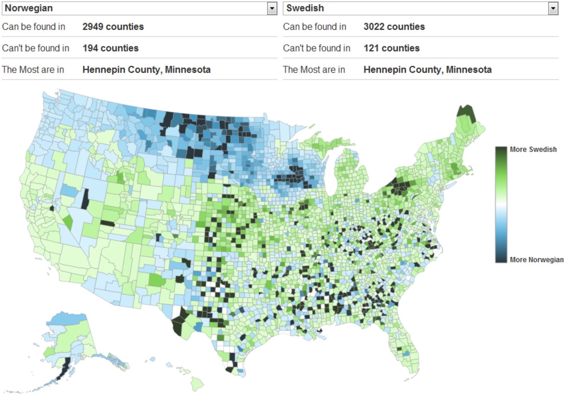
(click image to enlarge)
Credit: David Yanofsky
Dot Map
Heat Maps
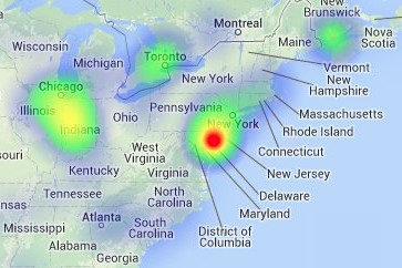
Another way to visualize point data
(click image to enlarge)
Credit: Patrick Wied
Pro's
- Shows density and distribution across a wide area
- Good visual impression of variations
- Can be used for statistical analysis
- Exact data can be shown
- Highlights clustering of data
- Can show absolute values
Con's
- Dot placement may be random
- Areas with no dots may give a false sense of emptiness
- Cannot be used to show data in the form of ratios
- Points may not have a spatial reference
- Subjective decisions made about dot size, dot value, and dot location
Sites, such as Colorbrewer and GIS Lounge, can also be great resources when making maps.